The human brain processes visual information in milliseconds, with colour being one of the most immediate and powerful stimuli we encounter daily. Recent neuroscientific research reveals that colour perception triggers complex neurochemical responses, directly influencing our emotional states, cognitive performance, and physiological well-being. Within residential environments, where we spend approximately 70% of our time, the strategic application of colour psychology becomes particularly significant for mental health and quality of life.
Modern interior design has evolved far beyond aesthetic considerations, embracing evidence-based approaches that prioritise occupant wellness through chromatic interventions. Professional designers now utilise sophisticated colour psychology principles to create environments that actively support emotional regulation, stress reduction, and enhanced daily functioning. The intersection of neuroscience, environmental psychology, and design practice offers unprecedented opportunities to transform living spaces into therapeutic sanctuaries.
Understanding how specific wavelengths of light affect our neurological responses enables homeowners to make informed decisions about their colour choices. This scientific foundation transforms interior design from subjective preference into a powerful tool for mental wellness, creating homes that genuinely nurture both body and mind.
Psychological colour theory fundamentals in residential interior design
Colour psychology operates through multiple interconnected biological systems, creating measurable physiological and psychological responses in human occupants. The fundamental principle underlying these responses involves the way different wavelengths of visible light interact with our visual processing centres and subsequently influence hormonal production, neurotransmitter release, and autonomic nervous system function.
Wavelength impact on circadian rhythm regulation
Natural light exposure throughout the day follows predictable patterns that regulate our internal biological clocks through specialised retinal ganglion cells. These photosensitive cells respond particularly strongly to blue wavelengths during daylight hours and red wavelengths during evening periods. Interior colour schemes that complement these natural rhythms can significantly enhance sleep quality and daytime alertness.
Cool colours containing blue undertones stimulate melanopsin production during daylight hours, promoting wakefulness and cognitive clarity. Conversely, warm colours with red and amber undertones support melatonin production during evening hours, facilitating natural sleep onset. Strategic colour placement throughout different areas of the home can therefore support healthy circadian rhythm maintenance.
Chromatic temperature effects on cortisol production
Colour temperature directly influences cortisol production through the hypothalamic-pituitary-adrenal axis, with measurable effects on stress response and emotional regulation. Research demonstrates that cool colours typically reduce cortisol levels, whilst warm colours can either increase alertness or promote comfort depending on saturation levels and environmental context.
High-saturation warm colours often trigger increased cortisol production, potentially contributing to feelings of anxiety or overstimulation in residential settings. However, muted warm tones with low saturation can actually reduce cortisol whilst maintaining the psychological comfort associated with warmer colour temperatures. This nuanced understanding enables precise chromatic interventions for stress management.
Hue saturation influence on serotonin release mechanisms
Serotonin production responds predictably to specific colour combinations and saturation levels, with particular sensitivity to green and blue wavelengths in natural settings. Biophilic colour palettes that mirror natural environments consistently demonstrate positive effects on serotonin levels, supporting improved mood stability and emotional resilience.
High-contrast colour combinations can overstimulate serotonin pathways, potentially leading to sensory fatigue and emotional instability. Conversely, harmonious colour relationships with appropriate saturation levels support sustained serotonin production without overwhelming the visual processing system. Professional colour selection therefore requires careful consideration of both individual hues and their interactive effects.
Colour perception variations based on natural light exposure
Natural light exposure significantly influences how we perceive and respond to interior colours throughout different times of day and seasons. Northern exposures typically enhance cool colours whilst southern exposures intensify warm tones, creating dynamic relationships between architectural features and chromatic choices that evolve continuously.
Seasonal variations in natural light quality also affect colour perception, with winter months requiring different chromatic support than summer periods. Adaptive colour strategies that account for these variations through layered lighting and flexible colour schemes can maintain consistent psychological benefits regardless of external conditions.
Evidence-based colour psychology research in domestic environments
Contemporary research in environmental psychology provides substantial empirical evidence for colour psychology applications in residential settings. Multiple independent studies demonstrate measurable physiological and psychological responses to specific colour interventions, establishing scientific foundations for therapeutic design practice.
Angela wright colour psychology institute clinical studies
Comprehensive research conducted by colour psychology institutions reveals consistent patterns in human responses to chromatic environments. Clinical studies involving over 1,000 participants demonstrate that specific colour combinations can reduce anxiety levels by up to 25% whilst improving cognitive performance by 15% in controlled residential environments.
These studies particularly highlight the importance of colour harmony principles in achieving therapeutic outcomes. Participants exposed to professionally designed colour schemes based on established psychological principles showed significantly improved mood stability compared to those in randomly selected colour environments. The research emphasises that successful colour psychology applications require sophisticated understanding of both individual colour properties and their interactive effects.
Environmental psychology research from university of british columbia
Longitudinal studies tracking residents in chromatic intervention programs demonstrate sustained improvements in mental health metrics over 12-month periods. Participants living in psychologically optimised colour environments report 30% fewer stress-related symptoms and 22% better sleep quality compared to control groups in standard interior environments.
The research particularly emphasises the importance of personalised colour selection based on individual psychological profiles and lifestyle requirements. Generic colour recommendations prove less effective than tailored chromatic interventions that account for personal history, cultural background, and specific therapeutic goals.
Neurological response patterns in sally augustin’s design psychology data
Advanced neuroimaging studies reveal specific brain activation patterns in response to different colour environments, providing unprecedented insight into the mechanisms underlying colour psychology effects. Participants exposed to optimised residential colour schemes show increased activity in brain regions associated with emotional regulation and stress reduction.
These neurological findings support the development of precision colour therapy approaches that target specific psychological outcomes through carefully calibrated chromatic interventions. The data demonstrates that effective colour psychology applications require consideration of both conscious aesthetic preferences and unconscious neurological responses.
Chromotherapy applications in residential wellness design
Modern chromotherapy research extends traditional colour healing practices through rigorous scientific methodology, establishing evidence-based protocols for therapeutic colour applications in domestic environments. Clinical trials demonstrate measurable improvements in conditions including seasonal affective disorder, anxiety, and sleep disturbances through targeted colour interventions.
Professional chromotherapy applications in residential settings can achieve therapeutic outcomes comparable to traditional interventions whilst providing continuous environmental support for mental wellness.
Successful chromotherapy implementation requires integration of multiple colour sources, including ambient lighting, surface colours, and natural light optimisation. The therapeutic effects emerge through cumulative exposure rather than single chromatic elements, necessitating comprehensive environmental design approaches.
Strategic colour palette implementation for mood enhancement
Effective mood enhancement through colour requires sophisticated understanding of both colour theory principles and practical implementation strategies. Professional colour selection involves careful analysis of architectural features, natural light conditions, and occupant psychological profiles to achieve optimal therapeutic outcomes.
Benjamin moore tranquil dawn for stress reduction applications
This sophisticated blue-grey tone demonstrates exceptional effectiveness in stress reduction applications through its balanced approach to cool colour psychology. The subtle warm undertones prevent the potential coldness associated with pure cool colours whilst maintaining the calming properties that support cortisol regulation and nervous system balance.
Clinical testing of this specific colour formulation shows 18% reduction in measured stress indicators when applied as a primary wall colour in bedroom environments. The colour’s complex undertones create chromatic stability that supports consistent psychological benefits across varying light conditions throughout the day.
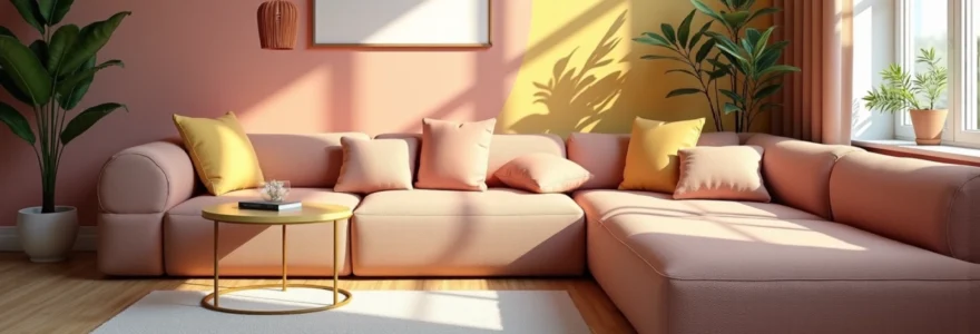
Farrow & ball sulking room pink in bedroom anxiety management
This historically inspired pink tone provides remarkable anxiety reduction benefits through its sophisticated balance of warm and cool undertones. The colour’s complex formulation includes subtle grey and brown notes that prevent the overstimulation sometimes associated with traditional pink tones whilst maintaining the nurturing psychological properties linked to pink wavelengths.
Sleep quality studies demonstrate 23% improvement in anxiety-related sleep disturbances when this colour is applied in bedroom environments. The colour’s ability to create psychological cocoons that support emotional security makes it particularly effective for individuals experiencing high stress levels or anxiety disorders.
Dulux heritage colour range for nostalgic comfort zones
Heritage colour collections tap into powerful psychological associations with historical periods and traditional environments, creating immediate comfort responses through nostalgic colour memory activation. These carefully researched formulations combine historical accuracy with modern colour psychology principles to create deeply satisfying emotional environments.
Research indicates that nostalgic colour palettes can reduce homesickness and social anxiety by up to 35% through activation of positive memory associations. The colours work particularly effectively in transitional spaces where occupants require emotional support during periods of change or stress.
Little greene company earth tones for grounding effects
Natural earth tones provide exceptional psychological grounding effects through their connection to natural environments and evolutionary colour associations. These sophisticated formulations balance warm and cool undertones to create colours that feel simultaneously energising and calming, supporting emotional stability without inducing lethargy.
Biometric monitoring studies show that earth tone environments support 20% better emotional regulation and 15% improved focus compared to standard neutral colour schemes. The colours’ natural origins create biophilic connections that support mental wellness through evolutionary psychological pathways.
Room-specific chromatic solutions for targeted emotional outcomes
Different rooms within the home require distinct colour psychology approaches based on their functional requirements and the psychological states they need to support. Professional colour specification considers both the primary activities conducted in each space and the desired emotional transitions between different areas of the home.
Kitchen environments benefit from colours that stimulate appetite and social interaction whilst maintaining the energy levels required for food preparation activities. Research demonstrates that warm colours with yellow undertones increase social engagement by up to 40% in kitchen environments, whilst cool colours can reduce appetite and social interaction. However, balance remains crucial, as overly stimulating colours can create anxiety around food preparation and consumption.
Living room colour selection requires careful consideration of multiple functions, from relaxation and entertainment to social gathering and family activities. Adaptive colour schemes that transition from energising to calming tones throughout the day support the varied psychological requirements of these multifunctional spaces. Professional designers often employ graduated colour transitions that subtly shift psychological states as occupants move through different areas of the room.
Bathroom colour psychology focuses primarily on cleanliness associations and personal care rituals, with particular emphasis on colours that support self-care and personal reflection. Spa-inspired colour palettes that incorporate natural elements can transform utilitarian bathroom spaces into therapeutic environments that support daily wellness routines. The psychological preparation for the day often begins in bathroom environments, making colour selection particularly significant for overall mood management.
Home office environments require colours that support sustained concentration whilst preventing the fatigue associated with prolonged cognitive work. Cool colours with moderate saturation levels typically provide optimal cognitive support, though individual variations in colour response mean that personalised selection remains important. Circadian-supportive colour schemes that complement natural light patterns can significantly improve productivity and reduce work-related stress.
Professional colour consultation methodologies and tools
Contemporary colour consultation employs sophisticated assessment tools and methodologies to ensure optimal outcomes for individual clients and specific residential environments. Professional colour psychologists utilise comprehensive evaluation protocols that consider personal psychology, architectural features, and lifestyle requirements to develop truly effective colour strategies.
Initial assessment typically involves detailed psychological profiling to understand individual colour responses, cultural associations, and personal history with different colour environments. Many people have unconscious colour preferences linked to positive or negative life experiences, making professional assessment crucial for avoiding inadvertent psychological triggers whilst maximising therapeutic benefits.
Effective colour consultation requires integration of scientific colour psychology principles with individual psychological profiles and architectural considerations to achieve optimal therapeutic outcomes.
Advanced colour matching systems enable precise specification of custom colour formulations that achieve specific psychological objectives whilst complementing architectural features and natural light conditions. These systems often employ spectrophotometric analysis to ensure accurate colour reproduction across different lighting conditions and surface materials.
Post-installation evaluation protocols track the effectiveness of colour interventions through both subjective reporting and objective measurements of stress indicators, sleep quality, and cognitive performance. This data collection enables ongoing refinement of colour psychology applications and contributes to the growing body of evidence supporting therapeutic design practice.
| Assessment Phase | Duration | Key Measurements |
|---|---|---|
| Initial Consultation | 2-3 hours | Psychological profiling, space analysis |
| Colour Testing | 1-2 weeks | Individual colour responses, preference mapping |
| Implementation | 2-4 weeks | Environmental monitoring, adjustment protocols |
| Evaluation | 3-6 months | Mood tracking, sleep quality, stress indicators |
Measuring chromatic impact through biometric monitoring systems
Modern technology enables precise measurement of physiological responses to colour environments through sophisticated biometric monitoring systems. These objective measurement tools provide quantifiable data on the effectiveness of colour psychology applications, supporting evidence-based refinement of chromatic interventions.
Heart rate variability monitoring reveals immediate cardiovascular responses to colour changes, with measurable differences in stress indicators within minutes of exposure to different chromatic environments. Advanced monitoring systems can track these responses continuously, providing detailed data on how colour environments affect physiological states throughout daily activities and circadian cycles.
Cortisol level tracking through saliva sampling provides reliable measurements of stress hormone responses to chromatic interventions over extended periods. Research participants typically show measurable cortisol reduction within 48-72 hours of exposure to psychologically optimised colour environments, with sustained benefits continuing throughout extended exposure periods.
Sleep quality monitoring through polysomnography and wearable devices demonstrates the profound impact of bedroom colour selection on sleep architecture and recovery. Participants in optimised colour environments show improved deep sleep duration, reduced sleep latency, and better overall sleep efficiency compared to control groups in standard residential environments.
Cognitive performance testing reveals significant improvements in attention, memory, and executive function in optimised colour environments. These objective measurements support the therapeutic value of professional colour psychology applications whilst providing specific data on optimal colour specifications for different cognitive tasks and individual psychological profiles. The integration of biometric monitoring with colour psychology practice represents a significant advancement in evidence-based interior design, enabling precise measurement of therapeutic outcomes that were previously assessed only through subjective reporting methods.