Creating a beautifully layered interior requires more than simply placing decorative objects around your home. Professional interior designers understand that successful accessory layering involves a sophisticated understanding of design principles, spatial relationships, and visual harmony. The art of layering transforms ordinary spaces into curated environments that reflect personality whilst maintaining aesthetic coherence.
Modern homeowners increasingly recognise that accessories serve as the finishing touches that elevate interior design from functional to exceptional. When executed properly, layering creates depth, visual interest, and a sense of lived-in luxury that makes spaces feel both polished and welcoming. This comprehensive approach to interior styling requires careful consideration of scale, colour coordination, texture contrast, and strategic placement techniques.
Understanding the science behind successful layering enables you to create interiors that appear effortlessly sophisticated. Professional designers employ specific methodologies and proven formulas to achieve this seemingly intuitive aesthetic, transforming collections of individual pieces into cohesive visual narratives that enhance both the functionality and beauty of living spaces.
Fundamental layering principles for interior design harmony
Professional interior design relies on established principles that govern how decorative elements interact within a space. These foundational concepts ensure that layered accessories contribute to overall design harmony rather than creating visual chaos. Understanding these principles provides the framework for making confident styling decisions that enhance your interior’s aesthetic impact.
Scale and proportion guidelines using the golden ratio method
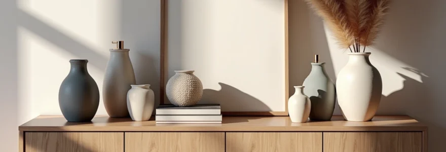
The golden ratio, approximately 1:1.618, serves as a mathematical foundation for creating visually pleasing proportions in interior design. When applying this principle to accessory layering, consider the relationship between object sizes and their placement within the overall composition. Large statement pieces should occupy roughly 60% of the visual weight, medium-sized objects 30%, and smaller accent pieces the remaining 10%.
This proportional relationship ensures that no single element overwhelms the composition whilst maintaining sufficient visual hierarchy. For example, when styling a console table, a substantial lamp might serve as the primary focal point, accompanied by medium-sized decorative bowls and smaller objects like candles or small sculptures. The golden ratio principle prevents the common mistake of using too many similarly-sized objects, which creates monotonous arrangements lacking visual interest.
Colour temperature coordination through kelvin value matching
Colour temperature coordination involves understanding the warm and cool undertones present in your accessories and ensuring they complement rather than conflict with each other. Professional designers often use the Kelvin scale as a reference point, with warm colours falling between 2700K-3000K and cool colours ranging from 4000K-6500K. Successful layering requires maintaining consistency within these temperature ranges or creating intentional contrast through careful colour selection.
When coordinating metallic finishes, consider brass and gold as warm metals (approximately 2700K), whilst silver, chrome, and pewter represent cooler temperatures (above 4000K). Mixing metal finishes successfully requires understanding these temperature relationships and ensuring that warm and cool elements are balanced proportionally. This approach prevents the jarring effect that occurs when incompatible colour temperatures compete for attention within the same visual field.
Texture contrast techniques for visual depth creation
Texture layering creates tactile interest and visual depth by combining materials with different surface qualities and reflective properties. The principle of texture contrast suggests pairing smooth, glossy surfaces with rough, matte finishes to create dynamic visual tension. This contrast technique prevents compositions from appearing flat or monotonous whilst adding sophisticated complexity to your arrangements.
Effective texture combinations might include pairing polished ceramic vessels with woven baskets, smooth marble objects with textured wood elements, or reflective glass pieces with matte stone accessories. The key lies in achieving balance rather than overwhelming the space with too many competing textures. Professional designers typically limit texture varieties to three or four distinct surface qualities within a single arrangement to maintain visual coherence.
Pattern mixing formulas following the 60-30-10 design rule
The 60-30-10 rule provides a proven formula for incorporating patterns into layered compositions without creating visual overwhelm. This principle suggests using a dominant pattern for 60% of the visual space, a secondary pattern for 30%, and an accent pattern for the remaining 10%. When applied to accessory layering, this might translate to using geometric patterns on larger pieces, organic patterns on medium-sized objects, and linear patterns on smaller accent pieces.
Successful pattern mixing requires identifying a unifying element, such as a shared colour or similar scale, that connects disparate patterns within the composition. For instance, you might combine large geometric prints, medium-sized floral patterns, and small striped accents, unified by a consistent colour palette. This approach allows for creative expression whilst maintaining the visual harmony essential for sophisticated interior design.
Strategic placement methodologies for decorative objects
The physical arrangement of decorative objects requires understanding spatial relationships and visual psychology. Professional designers employ specific placement strategies that maximise visual impact whilst ensuring practical functionality. These methodologies transform random collections of objects into purposeful compositions that enhance the overall interior design scheme.
Triangle composition theory for mantelpiece styling
Triangle composition theory utilises the visual stability and natural appeal of triangular arrangements to create balanced, pleasing displays. This technique involves positioning objects at varying heights to form implied triangular shapes, which the human eye naturally finds harmonious and satisfying. When styling mantelpieces, console tables, or shelving units, this principle ensures that compositions feel intentional and professionally executed.
Creating successful triangular arrangements requires establishing three distinct height levels: a tall anchor piece, a medium-height supporting element, and a low horizontal component. These elements don’t need to form perfect triangles but should create visual pathways that guide the eye in triangular patterns around the composition. This technique works particularly well for mantelpiece styling, where the vertical architecture provides natural structure for triangular arrangements.
Odd-number grouping psychology in vignette creation
Research in visual psychology demonstrates that odd-numbered groupings, particularly arrangements of three, five, or seven objects, appear more natural and visually appealing than even-numbered displays. This phenomenon occurs because odd numbers prevent the eye from dividing compositions into symmetrical pairs, encouraging more dynamic visual exploration and creating a sense of movement within static arrangements.
When creating vignettes, consider grouping decorative objects in clusters of three or five, varying their heights, sizes, and visual weights to maintain interest. This technique proves particularly effective for coffee table styling, bookshelf arrangements, and bathroom vanity displays. The odd-number principle helps prevent overly rigid, museum-like presentations that can make spaces feel sterile rather than lived-in and welcoming.
Height variation techniques using risers and platforms
Creating visual interest requires strategic height variation that prevents flat, two-dimensional arrangements. Professional stylists often employ risers, books, decorative boxes, and small platforms to elevate certain objects and create multi-level compositions. This technique adds architectural interest to flat surfaces whilst providing opportunities to showcase smaller objects that might otherwise be overlooked.
Effective height variation follows the principle of gradual elevation, where objects progress from low to high in gentle transitions rather than dramatic jumps. Books serve as excellent natural risers, providing both functional elevation and contributing to the overall composition’s intellectual appeal. When using artificial risers, ensure they complement rather than compete with the objects they’re supporting, often by choosing materials and colours that harmonise with the overall design scheme.
Negative space management for visual breathing room
Professional interior design recognises negative space as an active design element that provides visual relief and prevents compositions from appearing cluttered or overwhelming. Effective negative space management ensures that each decorative element has sufficient surrounding space to be appreciated individually whilst contributing to the overall composition. This principle requires restraint and careful consideration of spatial relationships.
The rule of thirds often applies to negative space management, suggesting that approximately one-third of any surface should remain unadorned to provide visual breathing room. This approach prevents the common tendency to fill every available space with decorative objects, which can create anxiety-inducing environments rather than the calm, sophisticated atmospheres that characterise professional interior design. Strategic use of negative space also provides flexibility for seasonal updates and lifestyle changes.
Material and finish coordination systems
Creating cohesive layered interiors requires understanding how different materials and finishes interact within shared spaces. Professional designers employ systematic approaches to material coordination that ensure accessories complement rather than compete with existing architectural elements and furniture pieces. This coordination creates visual flow and prevents the jarring disconnections that can occur when incompatible materials are placed in proximity.
Successful material coordination begins with identifying the dominant finishes already present in your space, including flooring materials, furniture finishes, hardware, and architectural details. These existing elements provide the foundation palette for selecting complementary accessories. The goal involves creating dialogue between materials rather than exact matching, which can appear sterile and lacking in personality.
When working with metal finishes, consider the undertones and reflective qualities of each material. Warm metals like brass, copper, and oil-rubbed bronze coordinate naturally with rich wood tones and warm colour palettes. Cool metals such as stainless steel, chrome, and brushed nickel harmonise with contemporary furniture and cooler colour schemes. Successfully mixing metal finishes requires maintaining consistent temperature relationships or creating intentional contrast through careful proportion and placement.
Natural material coordination involves understanding the inherent characteristics of wood, stone, ceramic, and textile elements. Wood accessories should complement rather than exactly match existing wood furniture, often by selecting pieces with similar grain patterns or undertones but different species or finishes. Stone and ceramic accessories provide opportunities to introduce texture and visual weight whilst maintaining neutral colour palettes that support rather than dominate the overall design scheme.
The most successful layered interiors achieve material harmony through repetition and variation, creating visual rhythm whilst preventing monotony through subtle differences in texture, scale, and finish quality.
Room-specific layering applications
Each room presents unique opportunities and challenges for accessory layering, requiring tailored approaches that consider functionality, traffic patterns, and specific aesthetic goals. Professional designers adapt general layering principles to meet the particular requirements of different spaces, ensuring that decorative elements enhance rather than impede the room’s primary functions.
Living room console table styling with arteriors and west elm pieces
Console table styling in living spaces requires balancing visual impact with practical considerations such as daily use and traffic flow. The console table often serves as a focal point that can anchor the room’s entire aesthetic, making careful accessory selection and arrangement crucial for overall design success. Professional styling techniques create sophisticated displays that appear effortless whilst serving functional purposes.
When working with contemporary pieces from retailers like Arteriors and West Elm, consider the clean lines and modern aesthetic these brands typically embody. Layer accessories in odd-numbered groupings, incorporating a substantial table lamp for both illumination and visual weight. Add medium-sized decorative objects such as ceramic vessels or sculptural pieces, balanced with smaller items like candles or small plants for organic elements.
Successful console styling also requires considering the relationship between the table and surrounding furniture. Ensure that decorative objects don’t obstruct sight lines or interfere with seating arrangements. The styling should complement rather than compete with artwork or architectural features positioned above or adjacent to the console. This holistic approach ensures that the console styling contributes to the room’s overall visual harmony rather than creating isolated decorative moments.
Bedroom nightstand curation using jonathan adler ceramics
Bedroom nightstand styling requires balancing aesthetic appeal with practical functionality, as these surfaces must accommodate daily necessities whilst contributing to the room’s restful atmosphere. Jonathan Adler ceramics offer bold patterns and sophisticated colour palettes that can serve as focal points whilst maintaining the serene quality essential for bedroom environments.
Effective nightstand curation typically includes a table lamp for reading, a small tray for jewellery or daily items, and one or two decorative objects that reflect personal style. When incorporating Jonathan Adler pieces, consider how their distinctive patterns and colours coordinate with existing bedding and window treatments. The goal involves creating visual interest without overwhelming the space’s calm aesthetic.
Symmetrical nightstand styling works well in traditional bedroom arrangements, whilst asymmetrical approaches suit more contemporary or eclectic design schemes. Regardless of the chosen approach, ensure that essential items remain easily accessible and that decorative elements don’t interfere with the room’s primary function as a restful retreat.
Kitchen counter accessorising with le creuset and staub collections
Kitchen counter styling presents unique challenges due to the need for maintaining hygiene standards whilst creating attractive displays that enhance the space’s aesthetic appeal. High-quality cookware collections from brands like Le Creuset and Staub can serve dual purposes as both functional tools and decorative elements, providing opportunities for beautiful displays that celebrate culinary interests.
When displaying cookware as decorative elements, consider grouping pieces by colour or size to create visual cohesion. Le Creuset’s distinctive colour palette allows for monochromatic displays that provide visual impact whilst maintaining kitchen functionality. Staub’s typically darker finishes work well for creating sophisticated, professional-appearing arrangements that suggest serious culinary commitment.
Effective kitchen styling also incorporates organic elements such as fresh herbs, seasonal fruits, or wooden cutting boards that add warmth and texture to harder surfaces. These natural elements prevent kitchen displays from appearing too sterile whilst providing practical benefits for cooking activities. The key involves balancing aesthetic appeal with the practical requirements of food preparation and cleanup.
Bathroom vanity organisation through aesop and byredo product display
Bathroom vanity styling requires particular attention to moisture resistance and daily functionality whilst creating sophisticated displays that enhance the space’s spa-like qualities. Luxury personal care products from brands like Aesop and Byredo offer attractive packaging that can serve decorative purposes whilst providing high-quality functional benefits.
Effective vanity organisation typically involves grouping products by function or aesthetic appeal, using attractive containers or trays to contain smaller items whilst preventing clutter. The minimalist packaging characteristic of high-end personal care brands often provides sufficient visual interest without requiring additional decorative elements, creating clean, sophisticated displays that suggest attention to quality and detail.
Consider the practical requirements of daily grooming routines when arranging vanity accessories, ensuring that frequently used items remain easily accessible whilst maintaining the overall aesthetic appeal. Incorporate elements like small plants, attractive mirrors, or textile elements that can withstand bathroom humidity whilst contributing to the space’s luxurious atmosphere.
Seasonal adaptation strategies for accessory rotation
Professional interior designers understand that successful layered interiors evolve throughout the year, incorporating seasonal elements that maintain freshness and reflect changing lifestyle patterns. Seasonal adaptation doesn’t require complete redesign but rather strategic updates that acknowledge natural cycles whilst preserving the underlying design integrity established through careful layering principles.
Developing a seasonal rotation strategy begins with identifying which accessories serve as permanent anchors and which elements can be easily updated to reflect changing seasons. Permanent pieces typically include substantial items like lamps, large decorative vessels, or architectural accessories that provide structural foundation for seasonal overlays. Variable elements might include textiles, small decorative objects, natural elements, and colour accents that can be adjusted quarterly.
Spring adaptations often involve introducing fresh colour palettes, incorporating flowering plants or branches, and lightening textile weights to reflect the season’s renewal energy. Summer styling might emphasise natural materials, coastal colours, and increased natural light optimisation. Autumn transitions typically include richer colour tones, textured materials, and elements that suggest harvest abundance and preparation for indoor living.
Winter styling provides opportunities for incorporating luxurious textures, deeper colour palettes, and elements that enhance the sense of warmth and comfort during colder months. Successful seasonal adaptation maintains design continuity whilst acknowledging natural cycles that influence mood and lifestyle patterns. This approach ensures that interiors remain dynamic and responsive to changing needs whilst preserving the sophisticated aesthetic achieved through careful layering principles.
The most effective seasonal adaptations involve approximately 20-30% of decorative elements, ensuring that changes feel fresh and intentional without disrupting the underlying design harmony that defines successful layered interiors.
Common layering mistakes and professional correction techniques
Even well-intentioned layering efforts can result in unsuccessful compositions when common mistakes undermine the principles of effective interior design. Understanding these frequent errors and their professional corrections enables you to avoid pitfalls that can transform sophisticated intentions into cluttered or incoherent displays that detract from rather than enhance your interior’s overall aesthetic impact.
One of the most prevalent mistakes involves scale mismanagement, where homeowners select accessories that are either too small for the space or too large for the intended arrangement. Professional correction involves reassessing the relationship between object size and surrounding elements, often requiring the replacement of inappropriately scaled pieces with alternatives that create proper visual hierarchy and proportional relationships.
Colour coordination failures represent another common challenge, particularly when enthusiasm for certain pieces overrides consideration of how they interact with existing elements. Professional designers typically resolve these issues by identifying unifying colour threads that can connect disparate elements or by strategic removal of items that create visual conflict. Sometimes the solution involves introducing transitional pieces that bridge colour gaps and create visual harmony.
Over-accessorising represents perhaps the most frequent layering mistake, where
the desire to include every cherished possession often overwhelms considerations of visual balance and spatial relationships. Professional resolution typically involves implementing the “edit ruthlessly” principle, where designers systematically remove approximately one-third of displayed items to create breathing room and allow remaining pieces to achieve their full visual impact.
Texture monotony represents another frequent oversight, where homeowners select accessories with similar surface qualities or finishes, resulting in flat, uninteresting compositions lacking visual depth. Professional correction involves strategic introduction of contrasting textures, ensuring that smooth surfaces are balanced with rough elements, matte finishes with glossy alternatives, and hard materials with soft complements.
Pattern conflicts often arise when enthusiastic homeowners attempt to incorporate multiple beloved patterns without considering scale relationships or colour coordination. Professional designers resolve these issues by identifying dominant patterns and relegating conflicting elements to supporting roles, often through size reduction or strategic repositioning that minimises visual competition whilst maintaining design integrity.
Height uniformity creates another common challenge, where accessories of similar dimensions create boring horizontal lines that fail to engage the eye or create visual movement. Professional correction involves strategic introduction of varied heights through risers, platforms, or naturally tall elements that break monotonous silhouettes and encourage visual exploration throughout the composed arrangement.
Lighting oversight frequently undermines otherwise well-executed layering schemes, where inadequate illumination prevents accessories from achieving their intended visual impact. Professional designers address this through strategic placement of accent lighting, table lamps, or directional fixtures that highlight key elements whilst creating atmospheric depth that enhances the overall composition’s sophisticated appeal.
The most successful layering corrections involve systematic evaluation of each design principle – scale, colour, texture, pattern, and placement – followed by strategic adjustments that restore visual harmony without completely dismantling existing arrangements.
Seasonal inflexibility represents a subtle but important mistake where homeowners create static displays that never evolve or adapt to changing lifestyle needs. Professional correction involves identifying approximately 20-30% of accessories that can be easily rotated or updated, ensuring that layered compositions remain dynamic and responsive to natural cycles whilst preserving underlying design integrity.
Finally, functional interference occurs when aesthetic considerations override practical requirements, resulting in beautiful displays that impede daily activities or create maintenance challenges. Professional resolution requires reassessing each accessory’s relationship to its intended function, often involving strategic repositioning or replacement with alternatives that serve both aesthetic and practical purposes effectively.