Wall decor represents the most transformative element in interior design, capable of completely altering a room’s atmosphere with strategic selection and placement. Beyond mere aesthetic enhancement, thoughtfully chosen wall art establishes visual hierarchy, reinforces design themes, and creates emotional resonance within your living spaces. The relationship between wall decor and interior style extends far beyond colour coordination, encompassing considerations of scale, material properties, lighting interactions, and spatial dynamics that professional designers leverage to create cohesive, sophisticated environments.
Modern homeowners increasingly recognise that wall decor serves as the visual bridge connecting disparate design elements whilst expressing personal identity within carefully curated spaces. Whether you’re drawn to minimalist photography, statement sculptures, or eclectic gallery walls, understanding the fundamental principles of wall decor selection ensures your choices enhance rather than overwhelm your interior design vision.
Understanding interior design styles for strategic wall decor selection
Interior design styles provide the foundational framework for intelligent wall decor decisions, establishing parameters for colour palettes, material selections, and compositional approaches. Each style carries distinct characteristics that influence how wall art should be selected, scaled, and positioned to achieve authentic aesthetic coherence. The most successful interiors demonstrate clear style consistency through every decorative element, from furniture selection to wall art curation.
Contemporary design trends increasingly favour style hybridisation, where elements from multiple aesthetic movements combine to create personalised environments. This approach requires deeper understanding of core style principles to ensure wall decor selections complement rather than conflict with your overall design vision. Professional interior designers often employ the 60-30-10 rule when integrating wall art, where dominant style elements occupy 60% of visual weight, secondary elements 30%, and accent pieces 10%.
Scandinavian minimalism: clean lines and neutral palette requirements
Scandinavian minimalism prioritises functionality, natural light maximisation, and carefully edited aesthetic choices that eliminate visual clutter whilst maintaining warmth. Wall decor within this style framework emphasises quality over quantity, favouring single statement pieces rather than complex arrangements. The colour palette typically restricts itself to whites, grays, and natural wood tones, with occasional black accents for contrast definition.
Textural variation becomes particularly important in minimalist spaces, where wall art must provide visual interest without overwhelming the serene atmosphere. Natural materials such as untreated wood, raw linen, and matte ceramics align perfectly with Scandinavian principles, whilst metallic finishes should remain subtle and brushed rather than polished. Photography featuring Nordic landscapes, architectural details, or abstract compositions in monochromatic schemes work exceptionally well within this aesthetic framework.
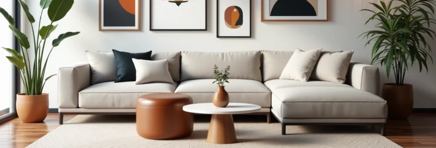
Mid-century modern: geometric patterns and warm wood tone integration
Mid-century modern design celebrates the optimistic aesthetic of the 1950s and 1960s, characterised by clean geometric forms, warm wood tones, and bold colour accents that reflect post-war innovation and prosperity. Wall decor selections should emphasise angular compositions, atomic-age patterns, and the integration of natural and manufactured materials that defined this influential design movement.
Geometric abstractions, architectural photography, and graphic prints featuring characteristic mid-century colour combinations of orange, teal, and mustard yellow create authentic period atmosphere. The starburst motif , boomerang shapes, and atomic-inspired patterns translate beautifully into contemporary wall art selections whilst maintaining historical accuracy. Framing should favour thin profiles in brass, walnut, or teak to complement the era’s furniture aesthetics.
Industrial chic: raw materials and urban aesthetic principles
Industrial chic draws inspiration from converted warehouse spaces and urban lofts, emphasising exposed structural elements, raw materials, and the beauty of functional design. Wall decor within this aesthetic should celebrate rather than disguise the room’s architectural bones, incorporating materials like steel, concrete, and reclaimed wood that echo industrial manufacturing processes.
Photography featuring urban landscapes, architectural details, and manufacturing processes aligns perfectly with industrial themes, whilst metal sculptures and oversized typography create appropriate focal points. The colour palette typically favours neutral tones with strategic black accents, allowing the natural patina of industrial materials to provide visual interest. Mounting systems should remain visible rather than hidden, treating hardware as decorative elements that reinforce the industrial aesthetic.
Maximalist eclectic: bold pattern mixing and colour saturation techniques
Maximalist design celebrates abundance, pattern mixing, and fearless colour combinations that create visually rich, layered environments reflecting diverse cultural influences and personal collections. Wall decor selection within maximalist spaces requires careful curation to achieve controlled chaos rather than overwhelming confusion. The key lies in establishing unifying elements that thread through apparent diversity.
Gallery walls become particularly important in maximalist interiors, allowing for the display of diverse artwork whilst maintaining compositional coherence through strategic colour repetition or frame consistency. Salon-style hanging techniques, where artwork covers wall surfaces from floor to ceiling, create the visual density that maximalist design celebrates whilst requiring sophisticated planning to avoid overwhelming viewers.
Wall decor categories and material specifications
Understanding material properties and production techniques enables informed decisions about longevity, maintenance requirements, and aesthetic compatibility with your interior environment. Different materials interact uniquely with lighting conditions, humidity levels, and architectural elements, influencing both immediate visual impact and long-term performance. Professional-grade materials often justify higher initial investment through superior durability and colour stability over time.
The relationship between material selection and interior style extends beyond aesthetic considerations to encompass practical factors such as cleaning requirements, environmental sensitivity, and installation complexity. Modern manufacturing techniques have expanded options considerably, with digital printing technologies enabling high-quality reproductions on diverse substrates whilst traditional handcraft techniques continue to offer unique textural qualities that machine production cannot replicate.
Canvas art: stretched cotton vs linen substrate properties
Canvas remains the most popular substrate for contemporary wall art due to its versatility, durability, and ability to showcase both photographic and painterly techniques effectively. Cotton canvas offers excellent value whilst providing smooth surface texture ideal for detailed photographic reproduction, though it may be more susceptible to environmental changes than premium alternatives. The weave density significantly impacts print quality, with higher thread counts producing smoother surfaces suitable for fine detail reproduction.
Linen canvas provides superior archival stability and natural texture that enhances artistic presentation, particularly for abstract or painterly compositions where surface character contributes to overall aesthetic appeal. The natural irregularities in linen weave create subtle texture variations that prevent the clinical appearance sometimes associated with digital printing, whilst the superior dimensional stability reduces long-term stretching and warping concerns.
Framed photography: archival matting and UV-Protective glass options
Professional framing transforms photographic prints into museum-quality presentations whilst providing essential protection against environmental damage. Archival matting materials prevent acid migration that can cause discolouration over time, whilst proper spacing creates visual breathing room that enhances photographic impact. The mat colour selection significantly influences how viewers perceive the image, with neutral tones typically providing the most versatile presentation options.
UV-protective glazing represents critical investment for valuable photography, filtering harmful wavelengths that cause fading whilst maintaining optical clarity. Museum glass eliminates reflections almost entirely, creating the illusion that no barrier exists between viewer and artwork, whilst conservation glass provides excellent protection at lower cost with minimal reflection increase. Anti-reflective coatings have revolutionised framed art display by eliminating the viewing angle limitations that traditional glass imposes.
Metal wall sculptures: Powder-Coated steel and brushed aluminium finishes
Metal wall sculptures introduce three-dimensional elements that cast shadows and create lighting interactions impossible with flat artwork, adding dynamic visual interest that changes throughout the day as natural light shifts. Powder-coated steel offers exceptional durability and colour variety whilst maintaining cost-effectiveness for larger installations, though the coating quality significantly impacts long-term appearance and corrosion resistance.
Brushed aluminium provides naturally corrosion-resistant properties with distinctive textural qualities that complement contemporary interiors, particularly those featuring stainless steel appliances or industrial design elements. The directional brushing creates linear light reflection patterns that add subtle movement to wall surfaces, whilst the material’s lightweight properties simplify installation compared to steel alternatives. Surface treatments can dramatically alter aluminium’s appearance, from subtle satin finishes to dramatic anodised colours that maintain metallic character whilst introducing bold colour statements.
Textile wall hangings: macramé, woven tapestries, and fabric panel systems
Textile wall hangings introduce softness and acoustic benefits to interior spaces whilst providing opportunities for cultural expression and handcraft appreciation. Macramé techniques create intricate geometric patterns through knotting variations, offering dimensional texture that changes appearance dramatically under different lighting conditions. The natural fibres typically used in macramé work provide organic colour variations and aging characteristics that enhance rather than detract from long-term appearance.
Woven tapestries represent some of humanity’s oldest artistic traditions whilst offering contemporary relevance through modern interpretations and material innovations. The layering possibilities inherent in weaving techniques enable complex colour interactions and textural variations impossible in other mediums, whilst the inherent flexibility allows creative installation approaches including ceiling mounting and room division applications. Fabric panel systems provide modular flexibility for changing displays whilst incorporating acoustic treatment properties valuable in open-plan living environments.
The most successful wall decor selections balance aesthetic impact with practical considerations, ensuring your investment provides lasting satisfaction through changing trends and evolving personal preferences.
Spatial planning and scale proportioning techniques
Spatial relationships between wall decor and surrounding architectural elements determine whether your selections enhance or diminish your interior environment. Professional designers employ mathematical principles and proportional systems that create visual harmony whilst accounting for viewing distances, furniture placement, and traffic patterns that influence how artwork is experienced. Scale mistakes rank among the most common errors in residential wall decor, often resulting from purchasing decisions made in retail environments that don’t accurately reflect home proportions.
The psychology of scale affects how viewers perceive both artwork and surrounding space, with undersized pieces making rooms appear larger whilst oversized selections can create intimate, cocoon-like atmospheres. Understanding these relationships enables strategic manipulation of spatial perception through wall decor selection and placement, particularly valuable in challenging room proportions or awkward architectural configurations.
Golden ratio applications in wall art sizing
The golden ratio, expressed mathematically as approximately 1.618:1, appears throughout nature and classical architecture, creating proportional relationships that humans inherently find pleasing and harmonious. Applying this principle to wall art sizing ensures selections feel appropriate within their spatial context whilst creating sophisticated compositional relationships with surrounding design elements. For wall art placement above furniture, the golden ratio suggests artwork width should equal approximately 60% of the furniture width below.
Height relationships following golden ratio principles create vertical compositions that feel balanced and intentional rather than arbitrary. When determining artwork placement height above furniture, the golden ratio suggests positioning pieces so the bottom edge sits at approximately 38% of the distance between furniture top and ceiling height, though standard eye-level recommendations of 145-150 centimetres from floor to artwork centre remain practical starting points for most residential applications.
Gallery wall configuration: grid systems vs Salon-Style arrangements
Gallery wall success depends on establishing unifying principles that create coherence amongst diverse elements whilst maintaining individual piece identity. Grid systems provide structured frameworks that work particularly well in contemporary interiors, using consistent spacing and alignment to create order among varied artwork sizes and subjects. The 5-7.5 centimetre spacing rule between pieces creates sufficient visual separation whilst maintaining compositional unity.
Salon-style arrangements embrace controlled asymmetry and varied spacing that creates more dynamic, collected-over-time appearances suitable for traditional or eclectic interiors. This approach requires careful attention to visual weight distribution, ensuring no single wall area appears overcrowded whilst maintaining overall balance. Template cutting from kraft paper enables experimentation with arrangements before committing to wall mounting, preventing costly mistakes and ensuring optimal composition.
Ceiling height considerations for vertical art placement
Ceiling height significantly impacts optimal artwork placement, with standard 2.4-meter ceilings requiring different strategies than contemporary 3-meter or higher installations. Higher ceilings accommodate larger-scale pieces and elevated placement that would overwhelm standard residential proportions, whilst lower ceilings benefit from horizontal orientations that emphasise width rather than height. The relationship between artwork scale and ceiling height affects perceived room proportions, with vertical pieces emphasising height whilst horizontal selections expand perceived width.
Multiple artwork arrangements in high-ceiling spaces can extend higher than traditional eye-level recommendations, creating dramatic vertical compositions that celebrate architectural proportions. However, the viewing distance increases with elevation, requiring larger-scale pieces or bolder compositions to maintain visual impact from typical seating positions. Strategic lighting becomes particularly important for elevated artwork placement, ensuring adequate illumination without creating harsh shadows or reflective glare.
Furniture scale relationships and visual weight distribution
The visual weight relationship between wall decor and surrounding furniture determines compositional balance and influences how viewers navigate and experience your interior spaces. Heavy, dark furniture requires substantial wall art to achieve visual equilibrium, whilst lighter, minimal furniture allows for more delicate artwork selections without appearing insubstantial. Understanding visual weight distribution prevents common mistakes where beautiful individual elements fail to work harmoniously together.
Asymmetrical furniture arrangements require strategic wall decor placement to maintain visual balance and prevent spaces from feeling lopsided or uncomfortable. The principle of visual triangulation suggests positioning wall art to create implied triangular relationships with major furniture pieces, ensuring no single area dominates whilst maintaining dynamic visual movement throughout the space. This technique proves particularly valuable in open-plan living areas where furniture groupings must relate to multiple wall surfaces simultaneously.
Colour theory integration and lighting considerations
Colour relationships between wall decor and interior environments extend far beyond simple coordination, encompassing complex interactions between hue, saturation, value, and temperature that influence mood, perceived space proportions, and overall aesthetic success. Professional colour theory application considers how natural light changes throughout the day, artificial lighting colour temperatures, and the psychological effects of different colour combinations on occupant comfort and wellbeing. Understanding these relationships enables sophisticated colour decisions that enhance both immediate visual impact and long-term living satisfaction.
The phenomenon of simultaneous contrast causes colours to appear differently depending on their surrounding context, making wall art selection a complex balance between individual piece appeal and integration with existing colour schemes. Neutral wall colours provide maximum flexibility for artwork selection whilst bold wall colours require careful coordination to prevent visual conflict. The 60-30-10 colour distribution principle applies to wall art selection, where dominant colours should align with established room proportions whilst accent colours provide strategic emphasis without overwhelming the composition.
Lighting design significantly impacts how colours appear throughout the day, with natural north light emphasising cool tones whilst south-facing exposures intensify warm colours. LED lighting technology offers unprecedented control over colour temperature and intensity, enabling dramatic transformation of artwork appearance through strategic illumination. Understanding colour rendering index ( CRI ) values ensures artificial lighting accurately represents artwork colours, particularly important for valuable pieces or colour-critical applications where accurate representation matters.
Seasonal colour variations in natural light affect artwork appearance dramatically, with winter’s cooler, lower-angle light creating different colour relationships than summer’s warm, overhead illumination. Planning for these variations during artwork selection prevents disappointment when favourite pieces appear less appealing under different lighting conditions. Professional colour assessment under multiple lighting scenarios ensures wall decor selections maintain appeal throughout varying environmental conditions.
Successful colour integration creates seamless relationships between wall decor and surrounding elements whilst allowing individual pieces to maintain their unique character and visual impact.
Installation hardware and professional mounting solutions
Proper installation represents the critical final step that determines both safety and aesthetic success of your wall decor investments. Hardware selection must account for artwork weight, wall construction materials, and long-term stability requirements whilst remaining as invisible as possible to maintain clean aesthetic presentation. Understanding load distribution principles prevents wall damage and ensures secure mounting that protects valuable artwork whilst maintaining precise positioning over time.
Different wall construction types require specific hardware approaches, with solid masonry walls supporting significantly heavier loads than timber frame or plasterboard constructions. Professional installation often justifies its cost through proper hardware selection, precise placement, and insurance against damage from incorrect mounting techniques. The hidden costs of improper installation include wall repair, artwork damage, and potential safety hazards that far exceed professional installation fees.
Advanced mounting systems accommodate artwork changes and repositioning without wall damage, particularly valuable for renters or those who frequently update their decor. Track systems enable flexible arrangement whilst maintaining museum-quality presentation standards, though initial installation requires professional expertise to ensure proper load distribution and secure attachment. Picture ledge systems provide ultimate flexibility for changing displays whilst protecting walls from repeated fastener installation, though weight limitations restrict their application to lighter pieces.
Security considerations become important for valuable artwork, with specialized hardware providing theft deterrence whilst maintaining accessible display. Museum-quality mounting systems often incorporate security features that prevent casual removal whilst allowing authorized access for cleaning and maintenance. Climate considerations affect hardware selection, with humidity variations causing expansion and contraction that inferior fastening systems cannot accommodate without loosening or wall damage.
Budget allocation strategies and investment piece selection
Strategic budget allocation for wall decor balances
immediate visual appeal with long-term value creation, recognizing that quality wall decor represents both aesthetic enhancement and potential financial investment. Establishing clear budget parameters early in the selection process prevents impulse purchases whilst ensuring adequate allocation for pieces that truly enhance your interior design vision. The most effective approach divides your wall decor budget into categories based on room importance, viewing frequency, and replacement likelihood.
Professional designers typically recommend allocating 60% of your wall decor budget to key living areas where you spend most time and entertain guests, 30% to secondary spaces like bedrooms and home offices, and 10% to experimental pieces that allow for trend exploration without major financial commitment. This distribution ensures your most visible spaces receive appropriate investment whilst maintaining flexibility for personal expression and seasonal updates.
Investment pieces should demonstrate superior craftsmanship, archival materials, and timeless appeal that transcends temporary trends. Limited edition prints, original artworks, and pieces by established artists often appreciate in value whilst providing daily aesthetic satisfaction. However, the primary consideration should always be personal connection and design compatibility rather than potential financial returns, as artwork purchased purely for investment rarely integrates successfully into residential environments.
Quality reproduction prints and emerging artist works offer excellent value for budget-conscious buyers whilst providing opportunities to discover new talents before prices escalate. Print-on-demand services have revolutionized access to contemporary designs, though quality varies significantly between providers, making material specifications and color accuracy critical evaluation factors. Digital artwork platforms enable direct artist relationships that often provide better value than traditional gallery markups whilst supporting creative communities.
Strategic budget allocation recognises that wall decor investment extends beyond initial purchase costs to encompass framing, installation, and long-term maintenance considerations that affect total ownership value.
Framing costs can easily equal or exceed artwork prices, particularly for larger pieces requiring custom solutions or conservation-grade materials. Professional framing represents worthwhile investment for valuable pieces, whilst ready-made frames from quality manufacturers provide excellent value for prints and reproductions. The frame selection significantly impacts overall aesthetic success, making it essential to budget appropriately for this critical presentation component.
Maintenance and insurance considerations affect long-term ownership costs, with valuable pieces requiring periodic conservation assessment and specialized cleaning techniques. Homeowner’s insurance policies may require artwork appraisals and specific coverage additions for pieces exceeding standard policy limits. Climate control becomes particularly important for valuable works on paper or canvas, potentially necessitating environmental monitoring systems that add to ongoing ownership costs.
Financing options for significant artwork purchases include gallery payment plans, art leasing programs, and specialized art loans that enable acquisition of important pieces whilst managing cash flow impact. These arrangements often provide advantages over traditional credit options whilst building relationships with galleries and dealers that benefit long-term collecting goals. However, careful evaluation of terms and true cost of financing ensures decisions align with overall financial planning objectives.
The most successful wall decor strategies combine careful planning with opportunistic acquisition, maintaining wish lists for desired pieces whilst remaining open to unexpected discoveries that exceed original expectations. Estate sales, auction houses, and artist studio visits often yield exceptional finds at favorable prices for buyers willing to invest time in research and relationship building. Understanding market dynamics and developing relationships within the art community creates opportunities for access to pieces before they reach broader market awareness.
Technology integration increasingly influences wall decor selection and display, with digital frames enabling artwork rotation and smart lighting systems optimizing presentation conditions. These technological solutions require additional budget allocation but provide unprecedented flexibility for displaying extensive collections within limited wall space. The initial investment in quality digital display systems often justifies itself through reduced framing costs and enhanced viewing experiences that traditional static displays cannot match.