Creating a harmonious interior space requires more than simply selecting beautiful colours and textures—it demands an understanding of how these elements work together to create visual balance and emotional resonance. The art of combining colours and textures effectively transforms ordinary rooms into sophisticated environments that reflect personal style whilst maintaining professional design principles. Modern homeowners increasingly recognise that successful interior design lies in the strategic layering of materials, hues, and finishes that complement rather than compete with one another.
The challenge many face when styling their homes is achieving the delicate equilibrium between visual interest and cohesive harmony. Too many contrasting elements can create chaos, whilst insufficient variety results in bland, uninspiring spaces. Professional designers understand that mastering the relationship between colour temperature, texture weight, and material properties enables the creation of environments that feel both dynamic and serene. This sophisticated approach to interior styling has become increasingly relevant as people spend more time in their homes and seek spaces that truly enhance their daily experiences.
Colour theory fundamentals for interior design applications
Understanding colour theory forms the foundation of successful interior design, providing the scientific framework needed to create visually pleasing and psychologically comfortable environments. The colour wheel, developed from the physics of light perception, serves as your primary tool for selecting palettes that work harmoniously together. This systematic approach removes guesswork from colour selection and enables you to make confident decisions about paint colours, furnishing choices, and decorative accents throughout your home.
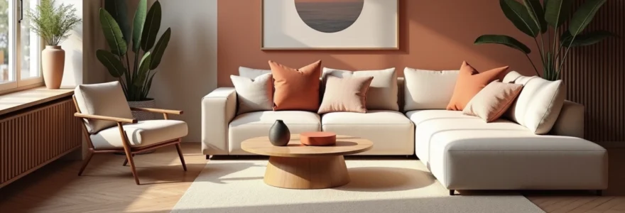
Professional designers rely on colour theory principles because they understand how different hues interact with natural light, artificial illumination, and surrounding materials. The emotional impact of colour choices cannot be underestimated—warm tones like terracotta and golden yellow create inviting, energetic atmospheres, whilst cool blues and greens promote tranquillity and focus. These psychological effects become particularly important when considering the function of each room and the mood you wish to establish.
Primary, secondary, and tertiary colour relationships in home environments
Primary colours—red, blue, and yellow—form the building blocks of all other hues and provide the strongest visual impact in interior spaces. These pure colours work exceptionally well as accent elements or statement features, but require careful consideration when used extensively. Secondary colours, created by mixing two primaries, offer more sophisticated options for larger surface areas. Green, orange, and purple provide rich foundation colours that can support more complex decorative schemes whilst maintaining visual stability.
Tertiary colours result from combining primary and secondary hues, creating nuanced shades like blue-green, red-orange, and yellow-green. These complex colours often appear more natural and comfortable in residential settings because they mirror the subtle variations found in nature. When selecting colours for adjacent rooms, consider how these relationships create flow throughout your home, ensuring that colour transitions feel intentional rather than jarring.
Warm versus cool colour temperature balance techniques
Colour temperature significantly influences the perceived atmosphere of interior spaces, with warm colours (reds, oranges, yellows) advancing visually and cool colours (blues, greens, purples) receding. This optical illusion can be strategically employed to alter room proportions—warm colours make large rooms feel more intimate, whilst cool colours help small spaces appear more expansive. The key lies in achieving balance between these temperature ranges to create spaces that feel both comfortable and visually interesting.
Professional designers often recommend the 80-20 rule for temperature balance: choose one temperature range for 80% of your colour palette and use the opposite temperature for accent elements. For instance, a primarily cool colour scheme featuring various blues and greys might incorporate warm brass fixtures and wooden furniture pieces to prevent the space from feeling sterile or unwelcoming.
Complementary colour schemes using the itten colour wheel method
Complementary colours sit directly opposite each other on the colour wheel and create the highest level of contrast when paired together. The Itten colour wheel method provides precise guidance for identifying these dynamic partnerships: red and green, blue and orange, yellow and purple. These combinations generate visual energy and can serve as the foundation for bold, sophisticated interior schemes when handled with appropriate restraint and balance.
The effectiveness of complementary schemes lies not in using pure, saturated versions of opposing colours, but in working with tinted, toned, or shaded variations. A sage green wall might be beautifully complemented by blush pink textiles, whilst deep navy cabinetry pairs elegantly with warm copper hardware and accents. This nuanced approach prevents complementary schemes from becoming overwhelming whilst maintaining their inherent visual dynamism.
Analogous colour harmonies for cohesive room design
Analogous colour schemes utilise three to five adjacent colours on the colour wheel, creating naturally harmonious palettes that feel serene and unified. These schemes work particularly well in bedrooms, living areas, and other spaces where visual calm is prioritised. Examples include blue-green-violet combinations or yellow-orange-red progressions, each offering opportunities for subtle variation whilst maintaining overall cohesion.
The beauty of analogous schemes lies in their inherent balance and the ease with which they can accommodate both neutral and accent elements. When working with analogous colours, vary the saturation levels and incorporate plenty of neutral tones to prevent the palette from becoming monotonous. This approach allows you to create sophisticated, layered interiors that feel both harmonious and visually engaging.
Texture classification and material properties in interior styling
Texture serves as the tactile language of interior design, communicating through surface quality, material weight, and physical characteristics that engage multiple senses simultaneously. Understanding texture classification enables you to create environments with appropriate visual weight distribution and sensory appeal. The strategic combination of smooth and rough, soft and hard, matte and glossy surfaces generates the contrast necessary for compelling interior compositions whilst maintaining overall harmony.
Material properties extend beyond simple visual appearance to encompass durability, maintenance requirements, and environmental impact. Natural materials like wood, stone, and linen bring inherent warmth and authenticity to interiors, whilst synthetic options offer enhanced performance characteristics and consistent quality. The most successful interior schemes thoughtfully combine both categories, leveraging the unique benefits of each to create balanced, functional environments.
Natural texture categories: jute, sisal, and raw linen applications
Natural fibres provide essential textural foundation elements that ground contemporary interiors with organic authenticity. Jute rugs and baskets introduce casual, relaxed textures that work particularly well in coastal or Scandinavian-inspired schemes. The coarse, slightly irregular weave of jute creates visual interest whilst remaining neutral enough to support bolder colour choices in artwork, cushions, or window treatments.
Sisal offers a more refined alternative to jute, with tighter weaves and greater durability making it suitable for high-traffic areas. Raw linen brings sophisticated texture to window treatments, upholstery, and bedding applications. Its natural variations in weave density and colour create subtle visual movement that prevents minimalist interiors from appearing sterile. These natural textures work best when combined with smoother materials like polished wood or ceramic elements.
Synthetic texture options: faux fur, velvet, and microfibre integration
Synthetic materials have evolved dramatically in both quality and aesthetic appeal, offering practical solutions for families with allergies or ethical concerns about animal products. High-quality faux fur provides luxurious tactile experiences whilst remaining more affordable and maintainable than genuine alternatives. When incorporating faux fur elements, consider them as accent pieces rather than dominant features to maintain visual balance.
Velvet surfaces, whether natural or synthetic, add immediate sophistication and depth to seating areas and bedroom applications. The directional nature of velvet pile creates subtle colour variations that change with viewing angle and lighting conditions. Microfibre technologies now produce fabrics that rival natural materials in comfort whilst offering superior stain resistance and durability—particularly valuable in family-friendly interior schemes.
Hard surface textures: travertine, reclaimed wood, and brushed steel
Hard surface materials provide structural foundation and visual anchor points within interior schemes. Travertine’s naturally occurring patterns and subtle colour variations make it an excellent choice for flooring and accent wall applications. Its porous surface texture creates interesting light play whilst maintaining neutral colour characteristics that support various decorative directions.
Reclaimed wood brings historical character and environmental sustainability to contemporary interiors. Each piece carries unique weathering patterns, nail holes, and colour variations that contribute authentic texture impossible to replicate artificially. Brushed steel finishes offer contemporary sophistication with subtle linear textures that complement both warm and cool colour palettes whilst maintaining the durability required for hardware and fixture applications.
Tactile contrast principles through mixed material combinations
Successful texture mixing requires understanding the relationship between opposing tactile qualities and their visual impact. Combining smooth marble countertops with rough-hewn wooden beams creates compelling contrast that prevents interiors from feeling monotonous. The principle involves balancing heavy visual textures with lighter alternatives—chunky knit throws paired with sleek leather furniture, or polished metal fixtures combined with matte ceramic elements.
Tactile variety engages the senses and creates memorable spatial experiences, but requires careful orchestration to avoid visual chaos. Consider texture weight distribution throughout the room, ensuring that heavy textures like thick carpets or substantial wooden furniture are balanced with lighter elements such as sheer fabrics or smooth glass surfaces. This approach creates dynamic equilibrium that feels both sophisticated and comfortable.
Strategic colour distribution using the 60-30-10 design rule
The 60-30-10 rule provides a proven framework for achieving balanced colour distribution throughout interior spaces. This proportional system designates 60% of the colour palette to dominant neutral or base colours, 30% to secondary supporting colours, and 10% to bold accent hues. This mathematical approach ensures that colour relationships remain harmonious whilst providing sufficient contrast and visual interest to prevent monotony.
The dominant 60% typically appears in major elements such as wall colours, large furniture pieces, and flooring materials. These foundational colours establish the overall mood and should be selected with longevity in mind, as they represent the most significant investment and are least easily changed. Neutral tones like warm whites, soft greys, or muted beiges work exceptionally well in this dominant role, providing sophisticated backdrops that accommodate seasonal decorative changes.
Secondary colours occupying 30% of the palette appear in medium-scale elements including upholstered seating, window treatments, and area rugs. This proportion allows for more personality and seasonal variation whilst maintaining overall scheme cohesion. The secondary colour should complement the dominant base whilst providing enough contrast to define furniture groupings and create visual hierarchy within the space.
The accent 10% delivers the personality and visual punch that makes interiors memorable and engaging. These bold colours appear in artwork, decorative accessories, throw pillows, and other easily changeable elements. This small proportion prevents overwhelming the senses whilst ensuring that the space feels intentionally designed rather than accidentally assembled. Accent colours can be seasonal, reflecting personal interests or current design trends without compromising the overall scheme’s longevity.
The most successful colour schemes feel effortless and balanced, with each element supporting the overall composition whilst contributing its unique character to the spatial narrative.
Texture layering methodologies for visual depth creation
Texture layering transforms flat, one-dimensional spaces into rich, engaging environments that invite exploration and interaction. This sophisticated design technique involves the strategic placement of multiple textural elements at varying scales and heights to create visual depth and tactile interest. The methodology requires understanding how different textures interact with light, shadow, and surrounding materials to achieve harmonious complexity rather than chaotic confusion.
Beginning with foundational textures—flooring, wall treatments, and major furniture pieces—establishes the textural base upon which additional layers can be built. Smooth hardwood floors might support a medium-pile wool rug, which in turn accommodates a plush velvet sofa adorned with linen and silk cushions. Each layer contributes its unique textural quality whilst supporting the overall compositional balance.
Mid-level texture layers include window treatments, lampshades, and decorative objects that occupy the middle visual plane. These elements bridge the gap between foundational textures and detail accessories, providing transitional textural experiences that guide the eye throughout the space. Consider how afternoon light filters through woven blinds to create moving shadow patterns on textured walls, or how the interplay of matte ceramic vessels against glossy tabletops generates visual interest.
Detail textures in the form of books, plants, artwork, and small decorative objects complete the layering process. These elements provide the finest level of textural variation and offer opportunities for personal expression and seasonal change. The cumulative effect of successful texture layering creates spaces that reward closer inspection whilst maintaining visual coherence from multiple viewing distances and angles.
Successful texture layering also considers the functional requirements of each space. High-traffic areas require durable foundational textures that can withstand daily use, whilst private spaces like bedrooms can accommodate more delicate textural elements. The balance between visual appeal and practical functionality ensures that beautifully layered textures remain sustainable and enjoyable over time.
Lighting impact on colour perception and texture enhancement
Lighting serves as the invisible designer that dramatically influences how colours appear and textures reveal themselves throughout different times of day and seasons. Understanding the relationship between light quality, colour temperature, and material properties enables you to make informed decisions about both artificial and natural lighting that enhance your carefully selected colours and textures rather than undermining them.
The quality and direction of light can completely transform colour perception—what appears as a warm, inviting beige in morning sunlight might read as cold grey under fluorescent illumination. This phenomenon, known as metamerism , requires careful consideration during the material selection process. Professional designers always evaluate colour and texture samples under multiple lighting conditions before making final decisions, ensuring that selections perform well throughout various daily scenarios.
Natural light direction effects on wall colour selection
North-facing rooms receive consistently cool, indirect light that can make warm colours appear muted and cool colours feel stark. These spaces benefit from warmer paint colours and textures that compensate for the lack of direct sunlight. South-facing rooms enjoy abundant warm light that can intensify colours and create dramatic shadow patterns that enhance textural elements throughout the day.
East-facing spaces experience dramatic lighting changes from warm morning light to cooler afternoon illumination, requiring colour selections that perform well under both conditions. West-facing rooms benefit from extended afternoon and evening light but may require window treatments to control intense late-day sun exposure that can fade fabrics and create uncomfortable glare on reflective surfaces.
LED colour temperature influence on fabric and textile appearance
LED lighting technology offers unprecedented control over colour temperature, typically measured in Kelvin degrees ranging from warm (2700K) to cool (6500K). Warm LED lighting enhances red and yellow undertones in fabrics whilst muting blues and greens, making it ideal for creating cosy, intimate environments. Cool LED lighting brings out blues and greens whilst potentially making warm colours appear less vibrant.
Textile appearance changes dramatically under different LED colour temperatures—a burgundy velvet sofa might appear rich and luxurious under warm lighting but could seem dull and flat under cool illumination. This relationship becomes particularly important when selecting fabrics for spaces with primarily artificial lighting, such as windowless bathrooms or interior hallways where natural light doesn’t reach.
Accent lighting techniques for highlighting textural elements
Strategic accent lighting transforms textural elements into focal points that add drama and visual interest to interior spaces. Track lighting positioned to graze textured walls reveals surface variations and creates dynamic shadow patterns that change throughout the evening. Picture lights illuminate artwork textures whilst table lamps with textured shades create pools of patterned light that enhance surrounding surfaces.
Under-cabinet lighting in kitchens highlights the texture of backsplash materials whilst providing functional task illumination. Uplighting behind textured room dividers or decorative screens creates dramatic silhouettes that serve as architectural features. The key lies in balancing accent lighting with ambient illumination to create layered lighting schemes that support both functional requirements and aesthetic goals.
Room-specific colour and texture coordination strategies
Each room in your home serves distinct functions that influence optimal colour and texture combinations. Living spaces require palettes and materials that accommodate both relaxation and entertaining, whilst bedrooms prioritise comfort and tranquillity. Understanding these functional requirements enables you to select combinations that enhance daily activities whilst maintaining visual continuity throughout your home.
Kitchen environments demand colour and texture selections that withstand moisture, heat, and frequent cleaning whilst providing visual warmth that encourages gathering and conversation. Smooth, non-porous surfaces like quartz countertops and ceramic tile backsplashes provide practical foundations, whilst textured wooden cabinetry and woven bar stools introduce warmth and visual interest. The colour palette should consider how food preparation activities and artificial lighting affect colour perception throughout different times of day.
Bathroom colour and texture coordination must balance moisture resistance with spa-like luxury. Large format tiles with minimal grout lines provide smooth, easy-to-
clean surfaces combine beautifully with natural stone accent walls and wooden vanity elements. Neutral colour palettes featuring whites, soft greys, and warm beiges create timeless elegance whilst allowing colourful towels and artwork to provide seasonal personality. Consider how steam and humidity might affect certain materials and finishes when making long-term selections.
Bedroom environments benefit from colour and texture combinations that promote restful sleep and personal sanctuary feelings. Soft, matte paint finishes in cool or neutral tones create calming backdrops, whilst layered textiles in varying weights and textures add comfort and visual interest. Blackout curtains in textured fabrics serve dual purposes of light control and acoustic softening, whilst natural fibre rugs provide warm landing surfaces for bare feet.
Dining areas require colour and texture coordination that enhances both intimate family meals and larger entertaining occasions. Rich, saturated wall colours can create dramatic backdrops that make gatherings feel special, whilst textured wallcoverings add sophisticated detail that rewards closer inspection. Upholstered dining chairs in performance fabrics combine comfort with practicality, whilst natural wood tables provide textural warmth that encourages lingering conversations.
Home office spaces demand colour and texture selections that promote focus and productivity whilst maintaining visual appeal during video conferences. Cool, calming colours help maintain concentration, whilst textured acoustic panels can improve sound quality and add architectural interest. Natural materials like wood and leather introduce warmth to technology-heavy environments, creating balanced spaces that feel both professional and personally meaningful.
Children’s spaces present unique opportunities for playful colour and texture combinations that can evolve as they grow. Durable, washable surfaces provide practical foundations, whilst removable wallpaper and changeable accessories allow for easy updates. Bold accent walls can showcase children’s artwork and collections, whilst neutral foundational elements ensure longevity as tastes mature and change over time.
Entryways and hallways serve as transitional spaces that should provide welcoming introductions to your home’s overall design aesthetic. These areas benefit from durable flooring textures that can withstand heavy traffic whilst introducing colour palettes that flow seamlessly into adjacent living spaces. Consider how natural light patterns move through these connecting areas throughout the day, selecting colours and textures that perform well under varying illumination conditions.
The key to successful room-specific coordination lies in understanding how each space connects to others whilst serving its unique functional requirements. Colour flow between adjacent rooms creates visual continuity that makes homes feel larger and more cohesive, whilst texture variations prevent the overall scheme from becoming monotonous. This approach ensures that each room feels distinctly appropriate for its purpose whilst contributing to the home’s overall design narrative.