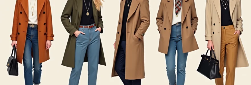
The difference between looking effortlessly chic and simply ordinary often lies not in the clothes themselves, but in the artful selection and placement of accessories. A basic white shirt and tailored trousers can appear mundane or magnificently sophisticated depending entirely on how you choose to enhance the ensemble. The modern approach to accessorising goes far beyond merely adding a handbag and earrings; it requires strategic thinking about proportion, colour theory, and the subtle interplay between different textures and materials.
Fashion industry statistics reveal that accessories account for approximately 23% of the total fashion market globally, yet many individuals underutilise their transformative power. The key lies in understanding that accessories serve as the punctuation marks of your personal style narrative. They can shift the mood from casual to formal, add sophistication to simplicity, or inject personality into otherwise neutral pieces. Mastering these techniques allows you to maximise your existing wardrobe whilst creating fresh looks that appear entirely new.
Statement jewellery layering techniques for minimalist wardrobe enhancement
The art of jewellery layering has evolved significantly beyond the traditional matching sets approach. Contemporary styling embraces the concept of considered chaos – the deliberate mixing of different metals, textures, and scales to create visual interest without overwhelming the wearer. This technique proves particularly effective when working with minimalist base garments, as the jewellery becomes the focal point that elevates the entire look.
Strategic layering begins with establishing a hierarchy of pieces. Think of your jewellery selection like composing a symphony – you need a primary melody supported by complementary harmonies. The most successful layering combinations typically feature one statement piece as the anchor, supported by two to three smaller, more delicate items that enhance rather than compete. This approach prevents the look from appearing cluttered whilst ensuring each piece contributes meaningfully to the overall aesthetic.
Cartier trinity ring stacking with delicate chain necklaces
The iconic Trinity ring design provides an excellent foundation for sophisticated stacking techniques. When working with such a distinctive piece, the key lies in selecting complementary items that echo its elegance without mimicking its boldness. Pair the Trinity ring with two additional bands of varying widths – perhaps a thin pavé diamond band and a simple gold wire ring. This creates textural variety whilst maintaining visual cohesion through the shared metal tones.
For necklace coordination, choose delicate chain lengths that create a cascading effect. A 16-inch choker-style chain paired with an 18-inch pendant necklace and a 22-inch longer chain creates perfect proportional balance. The varying lengths ensure each piece is visible whilst the delicate chains complement rather than overshadow the statement rings. Consider selecting chains with different link styles – perhaps a traditional cable chain, a delicate rope chain, and a simple box chain – to add subtle textural interest.
Tiffany & co. elsa peretti bean collection mixed metal coordination
The organic curves of the Bean collection provide an excellent opportunity to explore mixed metal coordination effectively. The key to successful mixed metal styling lies in maintaining balance between warm and cool tones whilst ensuring one metal family dominates the overall look. When incorporating Bean collection pieces, consider pairing rose gold items with sterling silver accents in a 70-30 ratio, allowing the warmer tones to lead whilst the cooler silver provides sophisticated contrast.
Textural mixing enhances this approach beautifully. Combine the smooth, polished surface of Bean earrings with a hammered silver bracelet and a twisted rose gold ring. This creates visual depth whilst the shared organic inspiration maintains thematic coherence. The mixed metals add sophistication and prevent the look from appearing too coordinated or costume-like, which often occurs when everything matches perfectly.
Pandora charm bracelet asymmetrical styling with watch pairing
Charm bracelets require careful consideration to avoid appearing juvenile or overwhelming. The secret lies in asymmetrical styling and thoughtful charm selection based on colour, scale, and personal significance. Rather than filling every available space, choose five to seven charms that tell a cohesive story or share a common aesthetic thread. Mix different charm sizes and shapes whilst maintaining a unified colour palette – perhaps combining silver charms with touches of blue enamel or crystal accents.
When pairing with a watch, consider the bracelet as part of a larger wrist composition. Place the charm bracelet on the opposite wrist to your watch, or if wearing both on the same wrist, ensure the watch face is proportionally larger than your largest charm. This prevents visual competition whilst creating an intentionally curated arm party effect. The watch should ideally share at least one metal tone with the bracelet to maintain cohesion.
Monica vinader gemstone earring clustering for visual impact
Gemstone earring clustering represents one of the most sophisticated approaches to contemporary ear styling. This technique involves combining multiple earrings of varying sizes and styles within the same ear, creating a personalised constellation effect. Start with a statement stud featuring your chosen gemstone – perhaps a London Blue Topaz or Green Onyx – as your anchor piece in the lobe position.
Build your cluster by adding smaller complementary pieces in additional piercings. Consider a delicate gemstone huggie hoop in the mid-cartilage area and a tiny gemstone stud in the upper lobe. The key lies in maintaining colour harmony whilst varying the scales and styles. If working with only one piercing per ear, consider asymmetrical styling – perhaps a statement ear climber on one side balanced by a simple stud on the other.
Strategic scarf draping methods for silhouette transformation
Scarves represent one of the most versatile and underutilised accessories in contemporary wardrobes. Beyond their practical applications, scarves function as architectural elements that can fundamentally alter the perceived proportions and silhouette of an outfit. The strategic draping of scarves allows you to create visual interest, add colour, introduce pattern, and modify the apparent shape of your body through clever optical illusions.
Professional stylists understand that scarves work most effectively when they serve a specific purpose beyond mere decoration. Whether you’re aiming to elongate your torso, add volume to your shoulders, create a waist definition, or simply inject a sophisticated European flair into your look, the draping technique you choose should align with your specific styling goals. The fabric choice, size, and draping method all contribute to the final effect, making scarf styling both an art and a science.
Hermès silk square bandana neck wrapping for collar enhancement
The classic silk square provides endless styling possibilities, with neck wrapping techniques offering particularly elegant collar enhancement options. For a sophisticated approach, fold your silk square diagonally to create a triangle, then roll it from the long edge to form a narrow band approximately two inches wide. Position this band around your neck with the ends meeting at the side rather than centre front, creating an asymmetrical focal point that adds visual interest to simple necklines.
The side-tie technique works exceptionally well with crew neck jumpers, simple blouses, and blazers worn open. It creates the illusion of a built-in collar detail whilst adding a pop of colour and pattern to otherwise plain garments. When selecting patterns, consider how they’ll interact with your outfit’s existing elements – geometric prints work beautifully with structured garments, whilst floral or paisley patterns complement softer, more romantic pieces.
Burberry check pattern belt alternative styling techniques
The iconic Burberry check pattern offers opportunities for creative styling that extend far beyond traditional belt applications. Consider using a silk scarf featuring the distinctive check as a belt alternative by threading it through belt loops and securing with a loose knot at the hip. This creates a softer waist definition compared to structured leather belts whilst adding the sophisticated heritage appeal of the pattern.
For high-waisted trousers or skirts, try the obi-style wrap technique. Position the centre of the scarf at your back waist, bring the ends around to the front, and create a wide, flat bow. This technique works particularly well with wide-leg trousers or A-line skirts, as it creates a defined waistline without the hard lines of traditional belts. The check pattern adds visual texture and British heritage appeal to contemporary silhouettes.
Liberty print pocket square hair accessory conversion
Liberty print pocket squares transition beautifully into sophisticated hair accessories, offering an unexpected way to incorporate pattern and colour into your hairstyle. For low ponytails or chignons, weave a folded pocket square through the base of the style, allowing the ends to cascade naturally alongside your hair. The intricate Liberty patterns add an artistic element that elevates simple updos into gallery-worthy statements.
Another effective technique involves using the pocket square as a headband alternative. Fold the square into a narrow band and position it approximately two inches back from your hairline, securing the ends behind your ears. This creates a sophisticated bohemian effect that works particularly well with second-day hair or when you need to quickly elevate a casual hairstyle for more formal occasions. The key lies in selecting Liberty prints that complement your outfit’s colour palette whilst providing enough contrast to remain visible against your hair colour.
Acne studios wool scarf shoulder draping for textural contrast
Wool scarves provide excellent opportunities for creating textural contrast, particularly when draped over the shoulders of smooth fabric garments. The Acne Studios oversized wool scarves work exceptionally well for this technique due to their generous proportions and luxurious drape. Position the scarf evenly across your shoulders, allowing it to fall naturally down your back and front, creating a sophisticated cape-like effect that adds warmth and visual weight to your upper body.
This technique proves particularly effective when wearing sleek, fitted garments underneath – think silk blouses, cashmere jumpers, or structured blazers. The contrast between the smooth base layer and the textured wool creates visual depth whilst the generous proportions of the scarf add dramatic flair to otherwise simple outfits. For daytime styling, secure the scarf with a delicate brooch at one shoulder to prevent slippage whilst maintaining the elegant draping effect.
Designer handbag positioning for proportional balance
The positioning and carrying method of your handbag significantly impacts the overall proportion and visual balance of your outfit. Many individuals default to conventional carrying methods without considering how different positions affect their silhouette or the outfit’s aesthetic impact. The size, shape, and positioning of your bag can elongate your frame, create waist definition, add structural interest, or provide colour focal points that tie your entire look together.
Contemporary fashion embraces unconventional bag positioning as a styling technique rather than merely a practical consideration. Strategic bag placement involves considering your handbag as an integral part of your outfit’s composition rather than an afterthought. The key lies in understanding how different carrying positions interact with your body’s natural proportions and your clothing’s silhouette to create the most flattering and visually interesting result.
Crossbody positioning works exceptionally well for creating diagonal lines that break up blocky silhouettes and add visual movement to static outfits. When wearing oversized blazers or boxy jumpers, position your crossbody bag so the strap creates a diagonal line across your torso, with the bag sitting at your hip. This technique creates waist definition whilst the diagonal strap adds dynamic visual interest. For structured bags like the classic quilted styles, ensure the bag’s geometric lines complement rather than clash with your outfit’s architectural elements.
Top-handle bags offer sophisticated styling opportunities when carried in the crook of your arm rather than by hand. This position creates elegant arm lines whilst keeping your hands free for other activities. The key lies in selecting bags with handles positioned to create comfortable carrying whilst maintaining the bag’s proportional relationship to your body. Medium-sized structured bags work best for this technique, as they’re substantial enough to maintain their shape whilst remaining comfortable to carry extended periods.
Clutch positioning requires particular consideration for evening and formal styling. Rather than carrying clutches traditionally by hand, consider tucking them under your arm with one corner visible, creating clean lines whilst maintaining easy access. For envelope clutches, the angled positioning adds geometric interest to flowing dresses or draped fabrics. When selecting clutches, consider how their proportions relate to your outfit’s scale – oversized clutches work beautifully with minimalist outfits, whilst delicate beaded or metallic clutches complement detailed or embellished garments.
The art of handbag positioning lies in understanding that your bag functions as both a practical accessory and a design element that can dramatically alter your outfit’s visual impact and proportional balance.
Vintage brooch placement strategies on contemporary garments
Vintage brooches represent one of the most underutilised accessories in contemporary styling, yet they possess remarkable power to transform modern garments into sophisticated, personalised statements. The key to successful brooch styling lies in understanding placement strategies that enhance rather than date your outfit. Traditional lapel placement often appears costume-like on contemporary clothing, but strategic alternative positioning creates fresh, modern interpretations of classic elegance.
Contemporary brooch styling embraces unexpected placement areas that create focal points and visual interest. Consider positioning statement brooches at the shoulder seam of jumpers or blazers, where they function as sophisticated shoulder details whilst remaining securely attached. This placement works particularly well with geometric or Art Deco designs that complement the structured lines of tailored garments. The brooch should align with your shoulder’s natural curve to maintain harmonious proportions.
Hat styling offers another sophisticated application for vintage brooches. Position smaller brooches on felt hats’ hat bands or fedora crowns to create personalised millinery statements. This technique proves particularly effective with enamel or jewelled brooches that catch light and add sparkle to neutral hat colours. The key lies in selecting brooches proportional to your hat’s size whilst considering how they’ll interact with your face shape and hairstyle.
Belt loop styling presents opportunities for incorporating smaller vintage brooches into casual outfits. Thread delicate brooches through belt loops on high-waisted trousers or jeans, creating subtle sparkle details that elevate everyday garments. This technique works best with Art Nouveau or floral designs that complement the organic curves created by the threading. Ensure the brooch’s pin mechanism can accommodate the belt loop width without causing damage to either the brooch or garment.
Scarf accent placement allows vintage brooches to secure and enhance draped accessories whilst adding historical charm to contemporary styling. Position brooches at scarf knots or where draped scarves cross your body, creating functional beauty that serves both practical and aesthetic purposes. This technique works exceptionally well with cameo brooches or pieces featuring intricate metalwork that complement the flowing lines of draped fabrics.
Seasonal colour theory application through accessory selection
Seasonal colour theory provides a sophisticated framework for selecting accessories that enhance your natural colouring whilst creating harmonious outfit compositions. This approach goes beyond trendy colour palettes to focus on scientifically-based colour relationships that flatter individual skin tones whilst creating visually pleasing combinations. Understanding how to apply colour theory through accessory selection allows you to create outfits that appear effortlessly coordinated whilst expressing your personal style preferences.
The foundation of successful seasonal colour application lies in identifying your dominant undertones and selecting accessories that complement rather than compete with your natural colouring. Warm undertones benefit from accessories in rich golds, warm browns, coral pinks, and earthy oranges, whilst cool undertones are enhanced by silver metals, blues, purples, and true reds. However, the application extends beyond simple warm-cool categorisation to encompass saturation levels, contrast requirements, and seasonal appropriateness.
Pantone colour of the year integration with neutral base outfits
Incorporating Pantone’s Colour of the Year through accessories provides a contemporary approach to staying current with colour trends without overwhelming your existing wardrobe. The beauty of this technique lies in using neutral base outfits as your canvas whilst introducing the trending colour through carefully selected accessories. For recent years featuring vibrant colours like Viva Magenta or Classic Blue, the key lies in balancing the colour’s intensity with your outfit’s overall proportions.
When working with particularly bold Pantone selections, consider the 80-20 rule – maintain 80% neutral base colours whilst introducing the trending shade through 20% of your accessories. This might translate to a trending colour handbag paired with neutral shoes and belt, or statement earrings in the featured shade balanced by a classic watch and neutral scarf. The technique ensures you appear current and fashion-forward without looking overwhelmed by trend-driven choices.
Texture integration enhances Pantone colour application significantly. Rather than introducing the colour through flat, matte accessories, consider how different textures affect colour perception. A Classic Blue velvet handbag appears richer and more sophisticated than the same shade in plain leather, whilst Viva Magenta in silk scarves creates different visual impact compared to the colour in structured accessories. Understanding these textural relationships allows for more nuanced colour integration.
Complementary colour wheel principles for accent piece selection
Understanding complementary colour relationships provides the foundation for creating striking accessory combinations that appear both sophisticated and visually dynamic. Complementary colours sit directly opposite each other on the colour wheel, creating natural tension that draws the eye whilst maintaining visual balance. When applying this principle to accessory selection, the key lies in using one colour as your dominant tone whilst introducing its complement through carefully chosen accent pieces.
For example, if your base outfit features navy blue elements, consider introducing orange or coral accessories through shoes, handbags, or statement jewellery. The contrast creates immediate visual interest whilst the scientific basis of the colour relationship ensures the combination appears intentional rather than accidental. However, successful application requires understanding colour saturation levels – muted navy pairs beautifully with burnt orange, whilst bright royal blue demands equally vibrant coral to maintain proportional intensity.
Split-complementary colour schemes offer a more subtle approach for those hesitant about bold contrasts. Instead of using direct opposites, select colours adjacent to your base colour’s complement. If working with purple base tones, rather than choosing yellow accessories, opt for yellow-orange or yellow-green accent pieces. This creates sophisticated colour relationships that appear harmonious whilst maintaining the visual interest of complementary contrasts.
The 60-30-10 rule provides an excellent framework for implementing complementary colour principles effectively. Use your base colour for 60% of the outfit, introduce a harmonious secondary colour for 30%, and reserve the complementary accent colour for 10% through carefully selected accessories. This ensures the bold contrast enhances rather than overwhelms your overall aesthetic whilst creating professional-looking colour coordination.
Monochromatic tonal layering with textural accessory variation
Monochromatic dressing represents one of the most sophisticated approaches to colour coordination, yet it requires careful attention to textural variation to prevent appearing flat or uninteresting. The technique involves working within a single colour family whilst exploring different shades, tints, and tones to create depth and visual complexity. Accessories play a crucial role in this approach, providing opportunities to introduce textural contrast that elevates monochromatic outfits from simple to stunning.
When working with monochromatic schemes, consider accessories as your primary tools for creating visual hierarchy and interest. A cream base outfit might incorporate ivory leather shoes, a champagne metallic handbag, and pearl jewellery in slightly different cream tones. The varying textures – smooth leather, reflective metal, lustrous pearls – create depth whilst the tonal variations prevent the look from appearing washed out or monotonous.
Textural contrast becomes particularly important in monochromatic styling because it provides the visual interest typically created through colour variation. Consider pairing smooth silk scarves with rough-textured wool blazers, or combining matte leather accessories with glossy patent shoes within the same colour family. The interplay between different surface treatments creates sophisticated layering that appears intentionally curated whilst remaining visually cohesive.
Metallic integration offers another powerful tool for enhancing monochromatic schemes without disrupting colour harmony. Gold accessories warm up cream, beige, and brown monochromatic outfits, whilst silver metallics enhance grey, navy, and black schemes. The key lies in selecting metallics that share undertones with your chosen colour family – warm golds with warm-toned colours, cool silvers with cool-toned palettes. This creates seamless integration that appears natural rather than forced, elevating your monochromatic styling to professional sophistication levels.